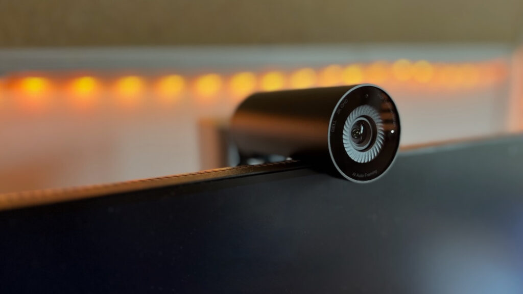
The Company Nothing was founded by Carl Pei, the former director of OnePlus in 2021. He calls this company the result of a pressing reset button, and the vision of removing barriers between people and technology.
Whatever that cryptic message meant, Nothing has introduced 2 products over these 2 years that goes against the grain of othordox design, namely the Nothing Ear (1) and Nothing Phone (1). Both of these products have a transparent aesthetic, and have prices that suit the masses – something OnePlus promised in the beginning.
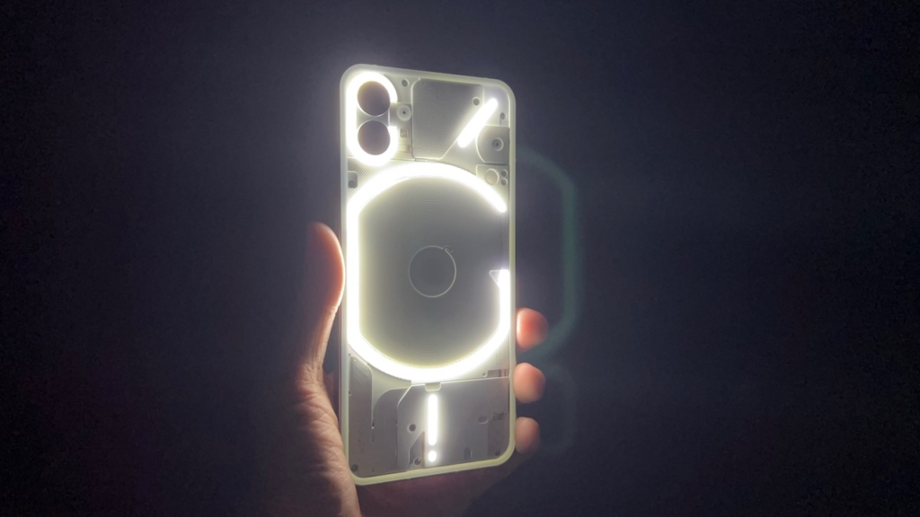
Starting at S$769, the Nothing Phone (1) features an extensive layout of LEDs on the back that cleverly light up when notifications come in, and acts like a ring light in dark conditions. No other phone has done this before, and it is definitely a head-turner.
Given that lots of attention is poured into the Glyph lights (what Nothing calls the LEDs), does it mean that the other parts of the phone are neglected especially at this price point? Let’s dive into my 2 week experience with the Nothing Phone (1) and find out the answer.
Design + Specs
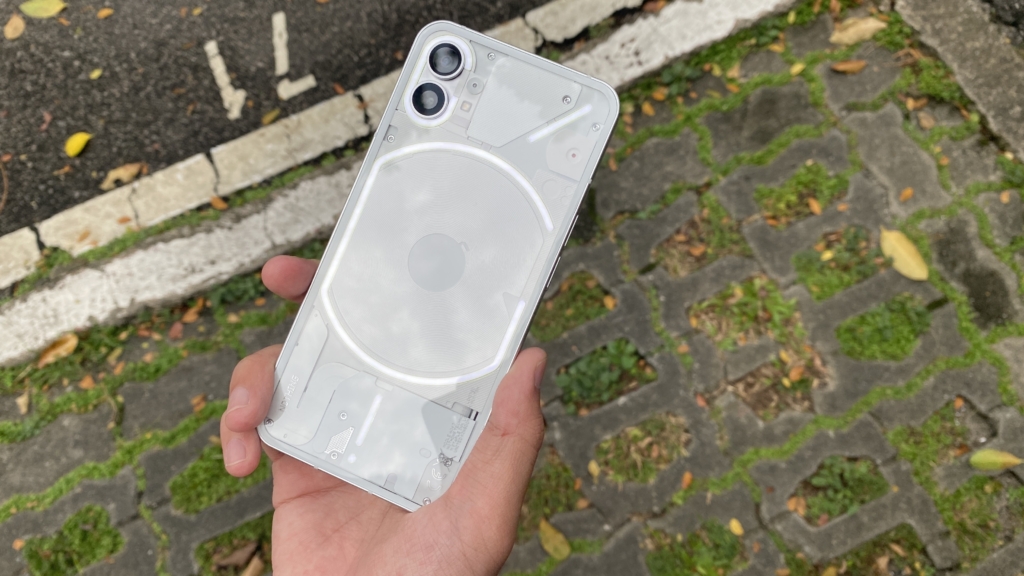
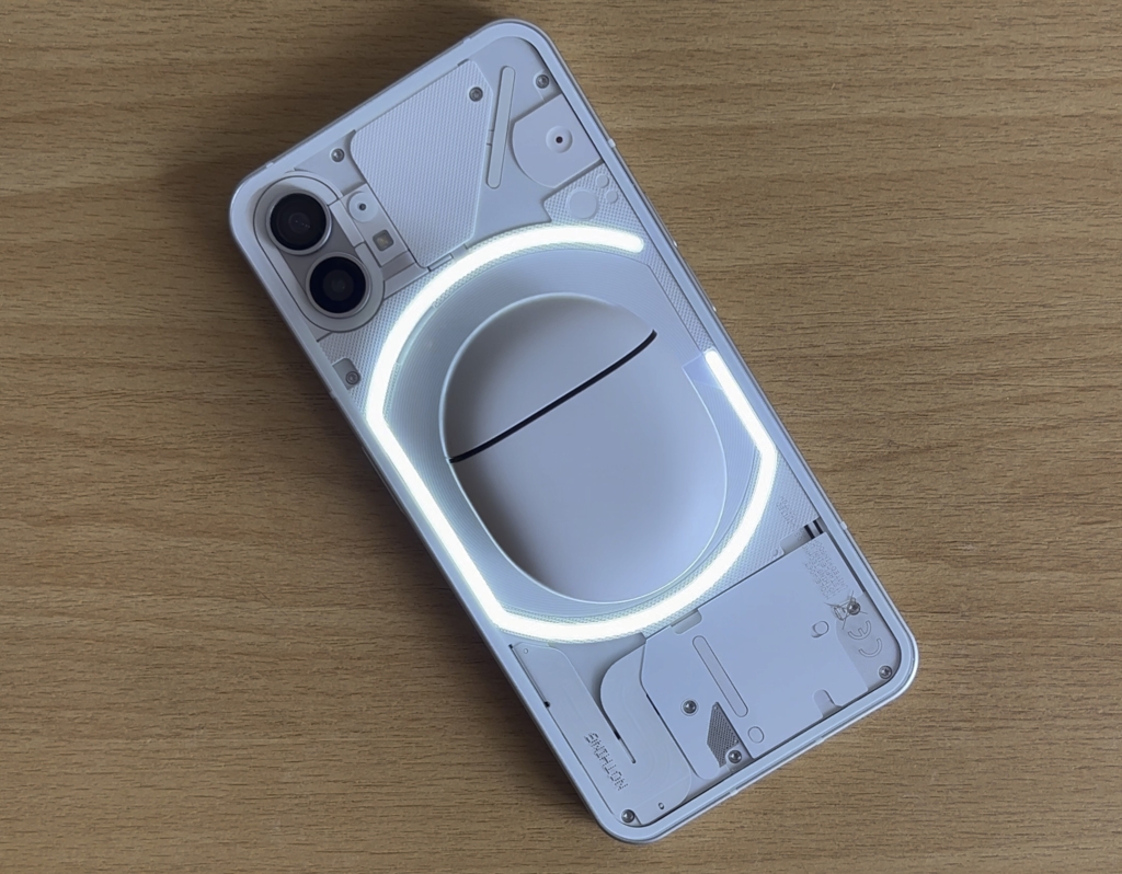
From the moment you unbox the Nothing Phone (1), you are greeted with the abovementioned Glyph Lights on the back of the phone. The LEDs wrap around the dual cameras for the ring light effect, and are curved around the centre of the phone in a “G” shape.
If you’re wondering, the Glyph lights do not stay on all the time, and only light up when you enable it in the camera app or when notifications come in. The phone bears an eerily similar shape and camera layout to the iPhone 11, causing some people to ask me if I’m holding the newest iPhone.
The bezels around the screen are not the thinnest, and there is a holepunch for the camera. Anyway, here are the specs for the base Nothing Phone (1):
| Screen | 6.55 inch Gorilla Glass 5, 120 Hz adaptive refresh rate, 1080p |
| Processor | Snapdragon 778G+ |
| Memory / Storage (GB) | 8 / 128 |
| Battery (mAh) | 4500 |
| Water And Dust Resistance | IP53 |
| Camera | 50 MP Wide, 50 MP Ultra-wide, 16 MP Selfie |
| Price (S$) | 769 |
Given the price, it is no surprise that Nothing went with the 5G equipped midrange Snapdragon 778G+. Unlike the Pixel 6a, this phone comes with a smooth adaptive 60 – 120 Hz and an expansive 6.55” display. It sports a pair of 50 MP rear lenses and has an adequately sized 4500 mAh battery. Probably due to the Glyph lights on the back, the phone is rated only at IP53.
Glyph Lights
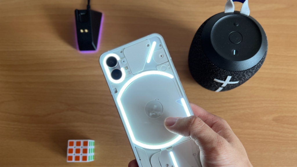
Now let’s talk more about Glyph lights, the main draw of this phone. This type of notification light isn’t actually new to Android phones. In fact, notification LEDs were found at the front of Android phones a few years back. Those LEDs could be customised to show colours like green, red or white when notifications from different apps come in.
It was pretty intuitive being able to check the type of notification without having your phone near you. Probably due to poor uptake, most Android phones got rid of the notification LED in favour of Always On Displays. The Nothing Phone (1) brings back the notification light concept, in the full Nothing styled glory.
The extensive Glyph light settings allow you to choose from 10 preset light-synced ringtones for phone calls, and even allows you to choose a different ringtone for each contact. If you find the Glyph lights too distracting, you can disable it when the phone rings. But where is the point of that?
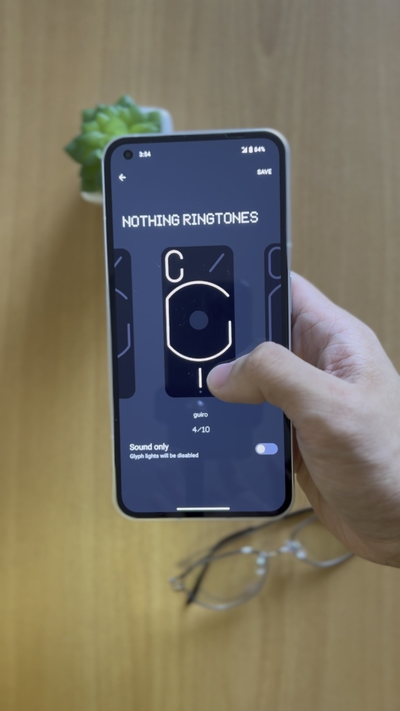
Similarly, you can also choose from 10 preset light-synced notification sounds for each of your apps. These notification sounds are much shorter than the ringtones, but range from a simple beep to an extended sequence of pulses.
You can even go into the settings and enable “Flip to Glyph” to disable notification sounds when the phone is faced down, leaving only the Glyph lights on. It minimises some distraction of course, but the lights can be distracting when you are trying to get in the zone.
The whole point of the Glyph lights is for you to have your phone faced down on a table when you’re not using it. That way, you only flip over your phone when you decide that the notification shown by the Glyph lights is important enough.
But that method of usage came at a cost. Rocking the Nothing Phone (1) without a case and frequently placing the screen faced down resulted in many scratches on my screen protector over my 2 weeks of usage.
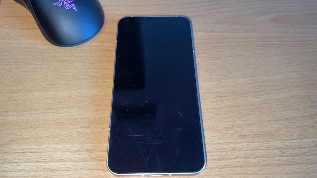
Sure, the plastic screen protector on the phone is not as hard as the Gorilla Glass 5 screen. But it does definitely raise some concerns over the durability of using the phone faced down without a case with raised corners. I would also be sure to get a durable glass screen protector just in case the screen gets in contact with hard objects.
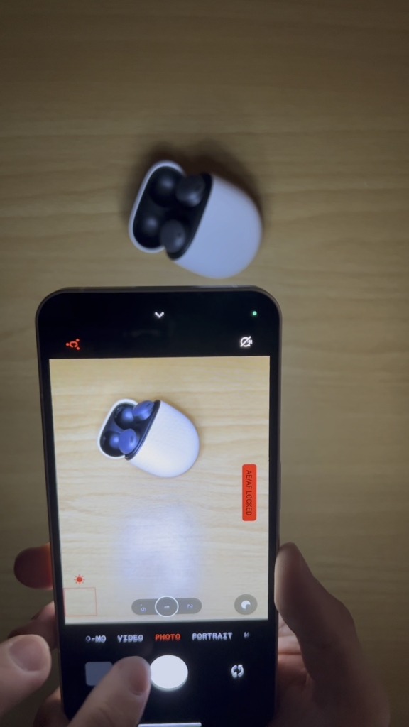
Another key use case of the Glyph Lights is in the camera. Tapping on the Flash icon toggles between the normal flash and the entire array of Glyph Lights. Taking photos, like of the Pixel Buds Pro in complete darkness with the Glyph Lights provided quite natural colours without the harshness of the flash. It’s like having a ring light on demand.
Glyph Lights get quite bright in direct sunlight if you max it out in the settings, so there is no need to worry about missing a notification light. My only wish is that Nothing opens up the API to the Glyph lights for users and developers to tinker around with. Having the community create Glyph ringtones would be really cool.
Camera
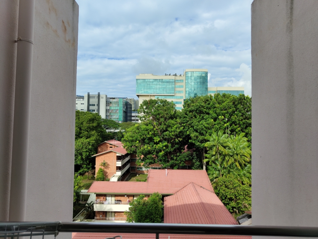
The Photos taken on the Nothing Phone (1) are very mediocre, even when it costs just S$769. Colours are not as vibrant as the S$598 Galaxy A53, and image processing is not as good as the S$749 Pixel 6a.

Many photos that I took had the corners of the image going out of focus for some weird reason. The top right edge of my prata wasn’t in focus despite using the stock camera settings. No, I checked and Portrait mode was not switched on.

The same story can also be said for this picture of my lunch. Even though my hands weren’t shaking and the settings were not tweaked, the piece of lettuce on my bowl refused to stay in focus. Even the colours look a little washed out.
Let’s face it, we all take pictures of our food more often than we like, and having parts of your plate being out of focus, it is a little concerning. I’m unsure if this will be fixed in a software update, but it’s not a good look for Nothing.
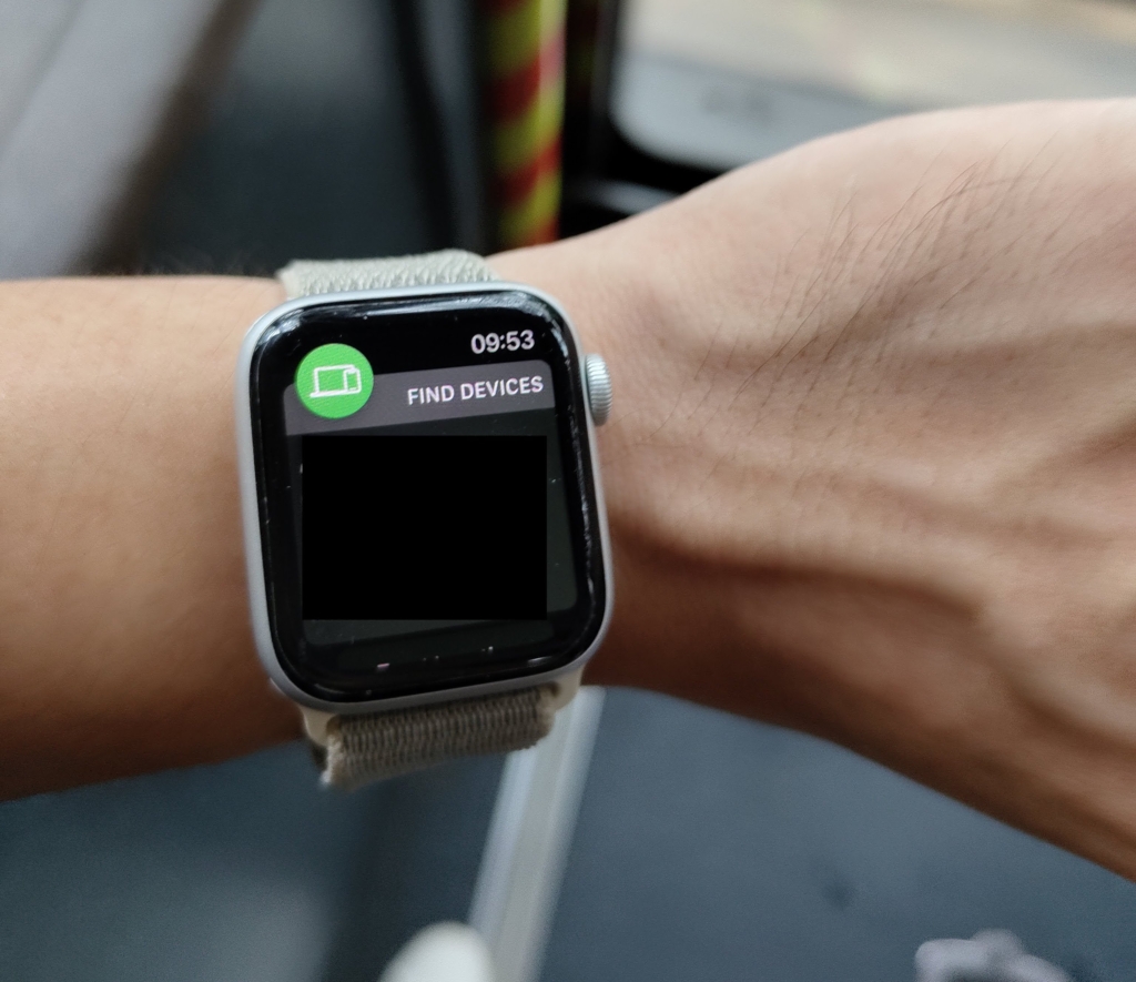
On the off chance that my photo subjects decide to stay in focus, I actually got pretty decent images with the natural bokeh of the 50 MP rear camera. The above image of my Apple Watch was taken on a moving bus, so props to the great OIS.
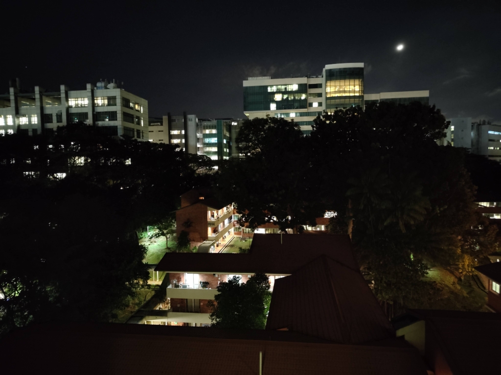
Night photography is fine, but the Pixel 6a at the similar price captures much brighter images. What I also realised was that the shutter speed of the camera was quite slow, especially for low light images. It took about a full 1.5 seconds to capture a stable image.
As you can tell from my experience, it is clear that there is nothing (pun intended) special about the cameras, and if you want best in class cameras at this price range, look somewhere else.
Performance
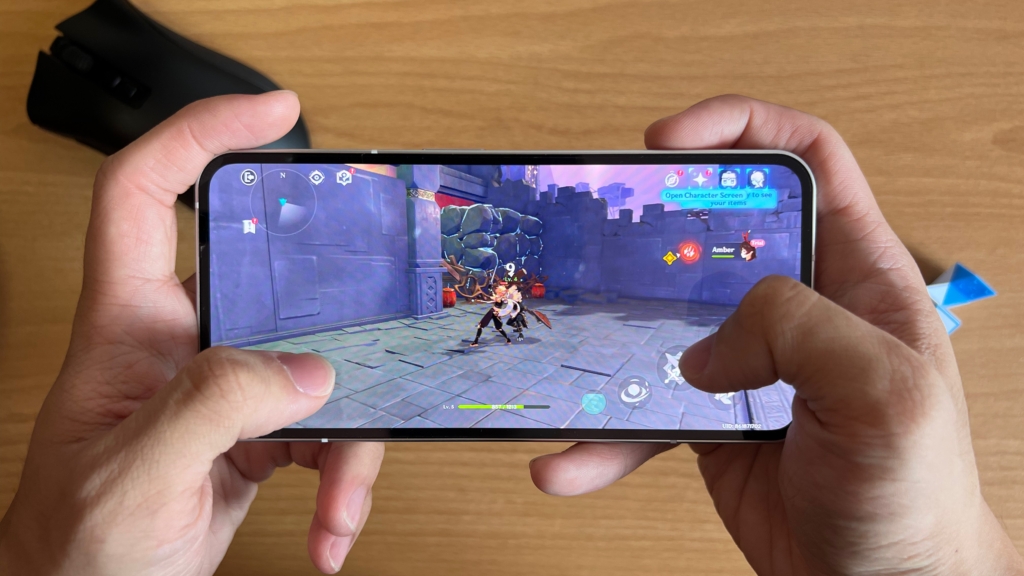
Rocking the midrange Snapdragon 778G+, you shouldn’t expect bleeding edge performance from the Nothing Phone (1). Day to day use presented no lags and ran most games pretty smoothly.
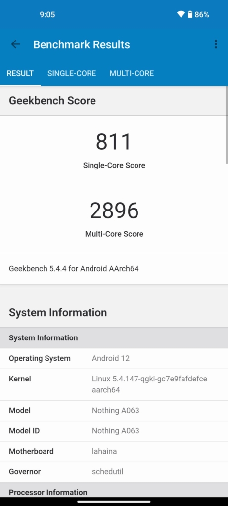
Running Geekbench 5 on the Nothing Phone (1) produced a single-core score of 811 and a multi-core score of 2896. It beats out the Tensor chip in the Pixel 6a in the multi-core score but loses in single-core performance.
For context, the latest and greatest Snapdragon 8+ Gen 1 gets about 1191 in single-core performance and 3455 in multi-core performance, or about 20% slower. This puts the performance of the Snapdragon 778G+ on par with the 2 year old Snapdragon 865.
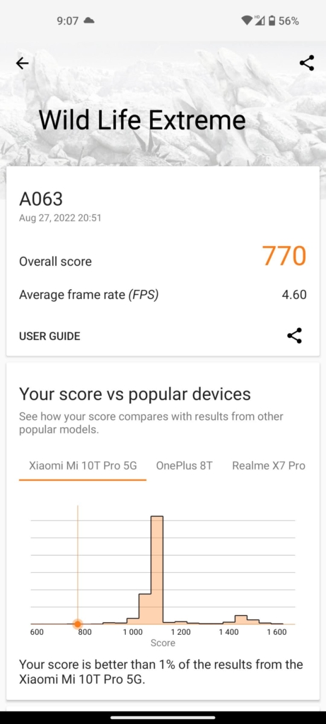
Running the GPU benchmark Wild Life Extreme on the phone gave a surprisingly bad score of 770. Mind you, the Pixel 6a got 1924, and the Tab S8 Ultra got 2167. I ran the test multiple times to confirm but the result remained the same.
I’m not sure if the reason for the underperformance of the 778G+ is due to optimisation or software limitations, but it ran games like Genshin Impact and Pokemon Unite on high graphic settings just fine. Upon cranking the settings from Genshin impact to Ultra High at 60fps, I noticed some frame drops.
Other than that, performance is pretty good, and can easily get through most tasks smoothly.
Battery
Battery is excellent on the Nothing Phone (1). With its somewhat substantial 4500 mAh battery, I could get through a full day of use from 10am – 8pm with about 30% left in the tank. Thanks to the adaptive refresh rate display, the phone was able to vary its refresh rate between 60 and 120Hz, saving some battery in the process.
The Snapdragon 778G+ also seems to be quite power efficient in handling everyday tasks without breaking a swear. I barely even noticed the phone overheating during extended periods of gaming.
If you need to juice up the Nothing Phone (1), plug it into a 33W charger (sold seperately) and get it to 100% in 70 minutes. Wireless charging is supported on this phone unlike the A53 and Pixel 6a, and supports up to 15W. No fancy OnePlus style 50W fast wireless charging here.
And when you plug in the phone, the bottom vertical part of the Glyph Lights turns on, acting as a bar indicator for the phone’s battery percentage. It goes away after a few seconds, but lights up as long as some motion is detected.
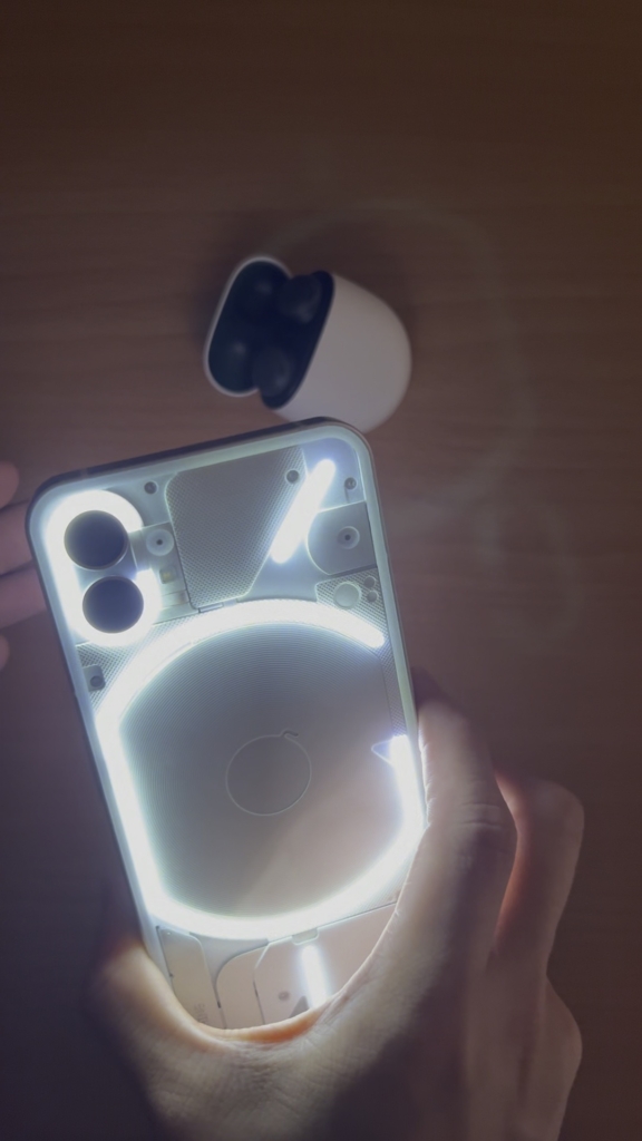
Reverse wireless charging is also supported on the Nothing Phone (1). Simply switch on reverse wireless charging in the notification shade, turn the phone around and place the target device onto the centre of the phone.
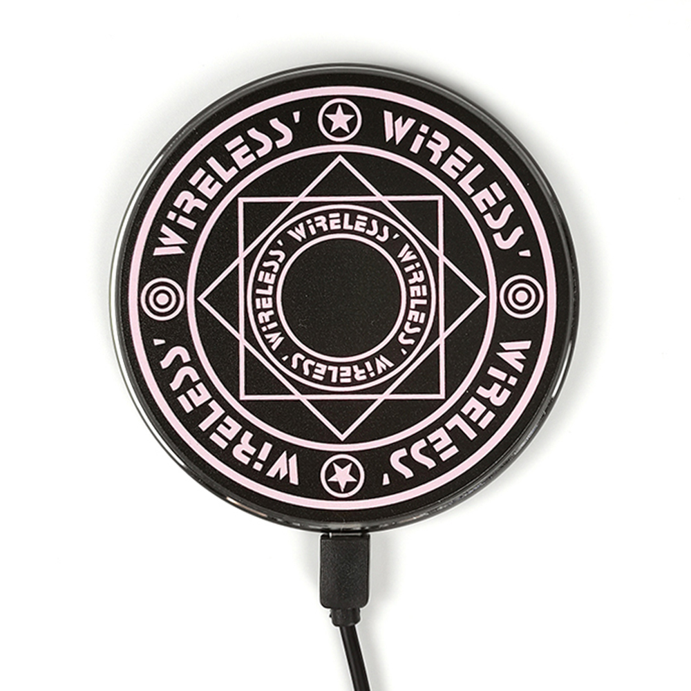
As seen from the image above, the centre part of the Glyph Lights switches on and pulses for a few seconds, indicating a successful connection. This style looks very similar to one of those magic spell circle wireless chargers and is pretty darn cool.
Conclusion
So, the main selling point of the Nothing Phone (1) is the Glyph Lights and thankfully, it is quite well implemented throughout the whole UI. It’s definitely a head turner and conversation starter when the Glyph Lights are activated. I’ve had instances where some of my peers and classmates would approach me to ask if it is the Nothing Phone, or ask what phone I was using.
Having granular controls over the Glyph ringtone for each contact and individual app allows you to understand the type of notification without turning over the phone. But as mentioned earlier, this requires you to have the phone faced down most of the time and the risk of scratching the display becomes a real concern.
Is it actually useful though? I would say that it’s mostly not. Other than the ring light feature in the camera app, I struggle to find many use cases for the Glyph Lights. Notifications already wake the display and show you a preview of the content, unless you can’t read it from a distance away.
If you are arguing for use in meetings or quiet settings with the volume turned off, I don’t see it being any less distracting than the plain old display waking up. And when you turn the Glyph lights off, that’s where the fun stops.
Beyond the Glyph Lights, the Nothing Phone (1) is an average mid range phone with great battery and smooth adaptive display. The mediocre cameras don’t stand a chance against the Pixel 6a at the same price point, and the performance is nothing to shout about.
This phone isn’t positioned as the best bang for the buck, but it is the only phone in the market to have LEDs on the back .If you are looking for a cool secondary phone, or don’t really care much about the cameras, getting the bold Nothing Phone (1) is a great way to make an impression and even spark new connections.
Derrick (Yip Hern) founded Tech Composition to provide valuable insights into the tech and finance world. He loves to scour the web for the best deals and embark on software projects during his free time, a typical geek, right?
